Header Photoshop Tutorials
Design a unique header for your website with Photoshop
In this photoshop tutorial, you will learn about some great techniques about making header, buttons and some more web graphics. easy to follow tutorial with a lot of images! ... Read More
Design an Elegant Abstract Site Header Image in Photoshop
In this tutorial, I will show you the processes I used to design this really cool, abstract style site header image in Photoshop, similar to the one I currently have on psdvault.com. Personally I can see an increasing trend of having a big and eye-catching header image for website/blogs, especially since broadband has become a commodity amongst the majori ... Read More
Easily Create a Beautiful, Unique Website Header
In this tutorial, Ill show you how you can create a beautiful, unique, abstract website header in just a few easy steps. This abstract lighting technique is one youll Wow a lot of visitors with! ... Read More
Design Studio Header
In this tutorial you will learn how to create a design studio header for your website. If you have any questions about this tutorial be sure to ask in the comments. Also, remember with all the tutorials, the psd is available for download. ... Read More
Reader Request: MSNBC Style Effect
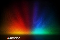
In this tutorial, I will create an effect like the one in the header of the MSNBC.com website. This effect is a reader's-request tutorial. If you have an effect you want to know how to achieve, just let us know in the comments and we will try to write a tutorial about it. ... Read More
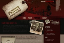
How to Create a Grunge Web Design in Photoshop
Photoshop is often the right tool for web design, especially if you're creating a design using numerous images and brush effects. In this tutorial, I'll show you how to create a complete grunge home page design. We'll design the header, sidebar, body, footer, and style everything to work together in a heavily textured and worn design. ... Read More
Sparkling Hot Girl in Photoshop
Ive seen some very nice images mixing photos with light effects and sparks. If you go to flickr in those Photoshop and Graphic Design groups you will see images with this effect. Theres a designer, I think he's Brazilian, who has some amazing designs using this style, his name is Leandro Demetrius and its really worth checking his work out. Anyway ... Read More
Create Your Own Letterpress, Inset, Debossed Text
The trend that has become commonly known as the letterpress effect has managed to make its way into a range of website designs. The effect itself is often added to text headers and buttons, giving an inset or debossed appearance. Take a look at this roundup of great examples of this trend, and follow on to a mini tutorial outlining how to create this effec ... Read More
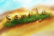
Create a Transparent Text Effect with Fresh Grass Texture and Custom Brushset
In this tutorial, I will show you the steps I took to create this Trasparent Text Effect, mixing with Fresh Grass Texture and Cloud Brushset. You can use the text effect in a wide range of occasions such as website header background, part of a natural themed design, etc. Along the way, I would like to show you my use of brushsets and the way I use them ... Read More
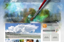
Create a Watercolor-Themed Website Design with Photoshop
Watercolor in graphic design has become very trendy the last couple of years, many websites and incredible designers are using this style and taking it to another level. Even knowing the technique is important in this kind of design, is more about creativity and experimentation. You will learn how to use the Art History Brush and combine it with watercolor c ... Read More
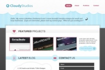
Simple & Cloudy Portfolio Layout in Photoshop
In this tutorial you will learn how to create a simplistic portfolio page design with a cloudy header. If you have any questions about this tutorial be sure to ask in the comments. Also, remember with all the tutorials, the psd is available for download. ... Read More
Create a Colorful Candy Store Website Layout in Photoshop
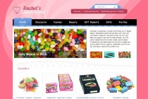
In this tutorial I will teach you how to create a bright and colorful candy store layout with a unique and creative background and header. As always the PSD files are available for download with this tutorial. If you have any questions, please ask in the comments. ... Read More
MSNBC New Background Design in Photoshop
In 2007 I wrote a Photoshop tutorial for PSDTUTS that was a user request, actually it was a request from not one but quite a few readers, they wanted to know how to create the MSNBC header effect. Back in those days it was a brand new design with a very colorful background image on the header. Now in 2010, they have a new website design and I was invited to ... Read More
Design a 3D web layout in photoshop
In this tutorial weâre going to design a 3D web layout. It will have perspective in the header, but the content area will have to remain clean in order to keep things readable and not irritating. There are a lot of things you can modify to your own needs in this tutorial, itâs mainly about learning some of the techniques used. ... Read More
How To Design A Video Game Web Layout
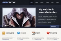
This tutorial teaches you to create a web site layout, from A to Z. The subject is regarding the Video play games, in this way, you will first start to create a header including a logo, a menu and an article. After this step, you will be able to create the contents, creating different blocks of news. You can find, attached to this tutorial, the .psd file use ... Read More


